FINAL DESIGN
C.N.G ROLLUP
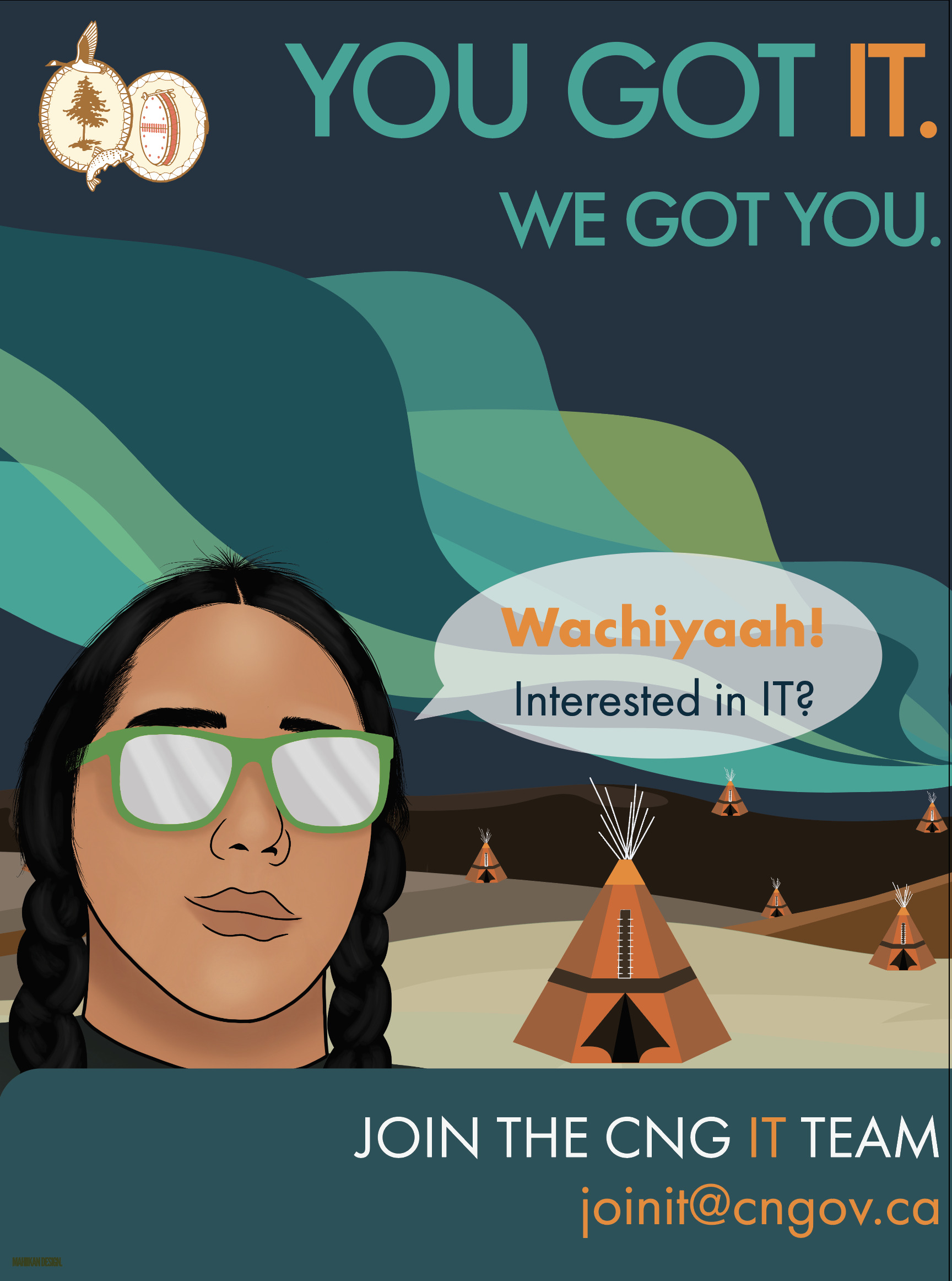
For this revised roll-up banner for the Cree Nation Government IT team, I focused on elevating both cultural relevance and visual impact. I developed a custom vector illustration inspired by the facial features of local Cree community members to ensure accurate and respectful representation. The bold typographic hierarchy—'YOU GOT IT. WE GOT YOU.'—creates a strong call-to-action, while the use of Cree syllabics in the greeting ‘Wachiyaah!’ fosters a sense of identity and belonging.
The layered landscape in the background reflects the natural beauty of Eeyou Istchee and helps ground the design in a sense of place. Bright accents, contrast, and a clean layout guide the viewer’s eye toward the contact information and message, balancing both clarity and culture in one cohesive composition.
