×

THE IDENTITY SUMMIT

For my personal project, I revisited my Design DNA assignment to better understand my style and creative direction. This helped me choose a project that truly reflects who I am as a designer. I invite you to explore it—not just to see the work, but to feel the meaning and personality behind each design.

EMOTIONAL & EXPRESSIVE

I naturally gravitate toward emotional tones like loneliness, peace, chaos, fear, and adventure. I love exploring themes of isolation, hope, and quirkiness—there’s something powerful in expressing raw emotion through design, and I embrace that full spectrum in my work.

CONCEPTUALLY BOLD

I’m drawn to abstract, non-objective, and fine art compositions. I enjoy pushing boundaries and diving into subject matter that’s weird, humorous, or even a little shocking—it keeps my creative energy alive and lets me challenge viewers to think differently.

COLOR-DRIVEN

Color is at the heart of my design approach. I often work with bright, saturated, monochromatic, and complementary palettes, and I enjoy experimenting with pastels and muted tones to set a specific mood. I use contrast intentionally to evoke feeling and rhythm.

VISUALLY STRUCTURED

Even when my concepts are wild, I anchor them in strong visual structure. I have a keen eye for scale, hierarchy, and balance, and I love using movement, symmetry, and asymmetry to guide the viewer’s eye across the composition with purpose.

PROJECT
OVERVIEW

CLIENT: Cree Nation Government (CNG)

PROJECT GOAL: To redesign the existing Cree Nation Business Summit Logo

PROJECT SCOPE: To create a logo that reflects the Cree Nation's identity and values, while also being modern and versatile.

PROJECT OUTCOME: A logo that is visually appealing, culturally relevant, and meets the needs of the Cree Nation Government.

PROJECT TIMELINE: 3 Months

MONT OTISH
The original logo, created using Canva, lacked originality and distinctiveness—it felt generic and disconnected from the organization’s identity. As a Cree corporate organization, the client wanted the visual mark to reflect Mont Otish, not resemble the Rocky Mountains, which carried the wrong cultural and geographic reference. While they appreciated the simplicity and clean aesthetic of the original, it lacked a strong conceptual foundation. Redesigning a logo that originated from a templated platform posed a creative challenge—but one I welcomed. I focused on refining the visual language, anchoring it in meaningful representation while preserving clarity and modernism.

TARGET AUDIENCE

18 YEARS OLD - 35 YEARS OLD

PROFESSION

FREELANCERS, BUSINESS REPRESENTATIVES, GRADUATING STUDENTS

INTEREST

ANYONE WHO WANTS TO LEARN MORE ABOUT STARTING UP A BUSINESS

MOODBOARD

Image 1

FIRST VERSION
OF SKETCHES

I created various sketches to explore different concepts and visual directions for the logo. The goal was to capture the essence of Mont Otish while ensuring the design was modern, versatile, and culturally relevant. Each sketch reflects a unique interpretation of the mountain's form and significance within the Cree Nation context.

SKECTH ONE
SKETCH TWO

SECOND VERSION
OF SKETCHES

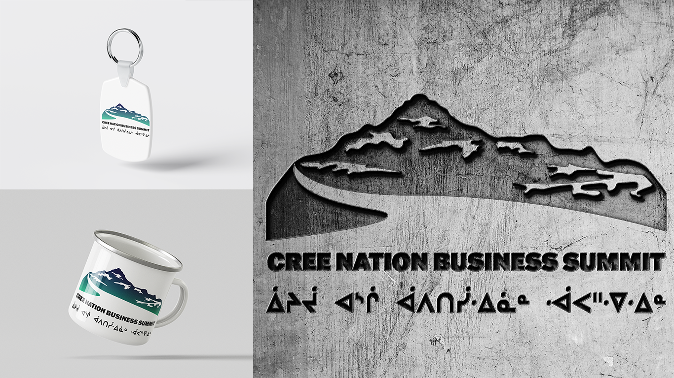
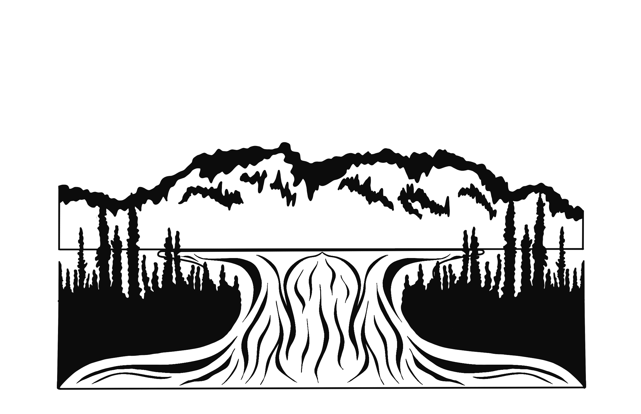
This second version emerged after exploring a range of sketches that experimented with different concepts and visual directions. The objective was to capture the essence of Mont Otish while ensuring the logo remained modern, versatile, and culturally grounded. Each sketch represents a distinct interpretation of the mountain’s form and its significance within the Cree Nation, blending symbolism with clean, intentional design.

THIRD VERSION
OF SKETCHES

For the third variation, I pushed the design into a more abstract visual language—moving beyond a minimal, literal interpretation toward a concept that emphasized form, symbolism, and emotional resonance. This approach allowed for a more dynamic representation of Mont Otish while maintaining visual clarity and adaptability across brand applications.

SKECTH ONE

CRITICAL FEEDBACK

OVERWORKED VISUALS

INSUFFICIENT VISUAL CLARITY

LOW VISUAL IMPACT

After reviewing my early sketches and getting feedback, I noticed a few things that needed work. Some designs were too detailed, which made them feel cluttered and hard to read. Others didn’t have that simple, clean look that a strong logo needs. A few just didn’t stand out enough—they blended in instead of making an impact. Taking that feedback, I focused on simplifying the shapes, making the concept clearer, and creating a design that felt bold, meaningful, and true to the Mont Otish identity.

AFTER FEEDBACK
VERSION 1

I narrowed the design down to a simple silhouette of Mont Otish, incorporating the lake in a clean, minimal way. However, in this version, the snow falls vertically—making it resemble the Rocky Mountains more than intended, so it still needed refining to better reflect the Cree landscape.

SKECTH ONE
SKETCH TWO

AFTER FEEDBACK
VERSION2

I refined the design down to a clean, minimal silhouette of Mont Otish, subtly incorporating the lake to keep the composition grounded and balanced. In this version, the snow falls horizontally—echoing the natural snowfall patterns and contours seen in Northern Quebec’s Mont Otish region. This small shift brought a sense of realism and rooted the design more authentically in its cultural and geographic identity.

At this point, I was creatively drained—I had nothing left in the tank to explore another concept. Honestly, this project pushed both my creativity and design skills to the limit. I never realized how complex it is to create a simple logo, especially when there’s so much to consider—form, meaning, function, and emotion. But I’m proud of the final direction because it truly reflects my Design DNA: emotionally expressive and boldly intentional. It's surreal to think that I used to drive past this mountain all the time, and now I’ve had the opportunity to design a logo that represents something so meaningful—not just for me, but for everyone back home, and for people beyond the community as well.

Check out the final logo below, which I’m really excited about. It’s a design that feels like it captures the spirit of Mont Otish and the Cree Nation in a way that’s both modern and deeply rooted in culture.
Image 1